How To Build and Deploy Your Personal Blog With Next.js
Image by Free-Photos from Pixabay
The source code for this guide is available on Github and you can view the original article on my blog (built with this starter).
If you’ve been thinking about building your own blog platform and have done a little research you’ve probably noticed that there are plenty of guides to choose from. So why write another one? I have a couple of reasons:
-
I read through a few of these guides and they always seemed to be missing something: they might be functional but lacking basic styling, styled but not production ready, using technologies that weren’t quite what I was looking for… they can leave you with technical issues to work through before you can ship your app and start publishing blog posts. That’s not to say that these guides aren’t useful. In fact I took a lot of inspiration from reading a few such guides (special shout out to Cassidy Williams’ excellent post on Netlify!) but I wanted to collect together all of the other bits and pieces that I’ve added while building my blog starter.
-
This project will likely serve as a base for additional features in future posts so, if nothing else, it provides a common starting point.
If you’ve come here from my previous post How to Stop Stalling and Ship Your Personal Blog you’ll know that I started my blog site with a short list of requirements; just enough to ship a not horrible looking, functional blog app and start publishing posts. So that’s what we’re doing here. I’ll show you how I built this blog and deployed it to the web, ready to start publishing articles.
Note: The goal of this guide is to build and deploy a blogging app in short order. There won’t be any deep dives, but you should be able to follow along just fine if you have some familiarity with JavaScript, React, HTML, CSS and Markdown.
Requirements and Tech
In my previous post I came up with this set of requirements:
Static site. Our blog should be snappy, lightweight and easily indexed. Basic styling. The bar is intentionally low here. Unless you’re a CSS whizz (I am not) styling can be a time vortex so nothing fancy, just make it easily legible and not a responsive train wreck. Markdown blog posts. I like markdown. It’s familiar, portable, and has a wide range of tooling available. Dynamic routing. We don’t want to make any functional code changes to publish a post, just write and publish. Code syntax highlighting. This is a developer blog after all, code needs to be easy on the eyes. Ship it! Deployed to the web.
Seems simple enough right? Here’s what we’ll use to make it happen:
-
React. This is the front end javascript library that I’m currently most productive in, it has a very rich ecosystem of supporting libraries and is performant (and fun! Don’t underestimate the importance of fun.) It also has some great framework options. Speaking of which…
-
Next.js will take care of the static site generation and dynamic routing. It also gives us the option to use SSR in future if we want. It’s a great framework and a big part of how we can ship this project so quickly.
-
React Markdown to convert our markdown posts into “ready to render” React components.
-
Highlight.js for code syntax highlighting.
-
TailwindCSS for styling. Next.js comes with built in CSS-in-JS support but I’m fast becoming a fan of the utility first nature of Tailwind. It also has a pluggable API that will give us a good head start on styling our content.
-
Netlify for hosting and continuous deployment. Netlify is an amazing platform for hosting Jamstack applications. It is super simple to use, has great developer ergonomics and documentation and a steadily growing range of supporting features and services (e.g. redirects, form handling, functions, etc).
Let’s dive in!
App Setup
First we’ll initialise our Next.js app. Run this in your terminal (we’ll be using npm for this tutorial, if you’d prefer to use yarn for this project then omit the — use-npm option):
npx create-next-app personal-blog --use-npm
You should now have a directory named personal-blog containing your new app. We’ll add a config file for Next.js in the root of the project to specify serverless operation for generating our static site:
// ./next.config.js
const nextConfig = {
  target: "serverless",
};

module.exports = nextConfig;
We’ll circle back to extend Next’s config later, but for now let’s start up our app. From the root of the project run:
npm run dev
Open your browser of choice and visit http://localhost:3000, you should be greeted with Next’s default home page. Nice! Next we’ll clear out the unnecessary boilerplate code so that we have a clean slate for our app. Delete the pages/api directory (we won’t be making use of any back end services for now), the contents of the styles directory (also remove the globals.css import from pages/_app.js), the contents of pages/index.js, and create a new directory at the root of the project: components. Our directory structure should now look like this:
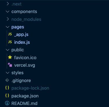
We’ve also just broken our app, so let’s get it working again. Add this to your pages/index.js file:
// ./pages/index.js
const Index = () => {
  return <h1>Blog Posts</h1>;
};

export default Index;
Basic Layout and Styling
We want our app to have a consistent layout so we’ll create a simple layout component to wrap all of our pages. Create a new component components/Layout.js and fill it with this:
// ./components/Layout.js
import Head from "next/head";

function Layout({ children, pageTitle }) {
  return (
    <>
      <Head>
        <meta name="viewport" content="width=device-width, initial-scale=1" />
        <title>{pageTitle}</title>
      </Head>
      <div>
        <header>
          <div>My Blog</div>
          <nav>Blog</nav>
        </header>
        <main>{children}</main>
        <footer>All content © Me</footer>
      </div>
    </>
  );
}

export default Layout;
The Head component from Next.js gives us a mechanism to insert our own header elements (meta tags, etc) into our pages. Now we can use this layout in our pages/index.js page:
// ./pages/index.js
import Layout from "../components/Layout";

const Index = () => {
  return (
    <Layout pageTitle="My Blog">
      <h1>Blog Posts</h1>
    </Layout>
  );
};

export default Index;
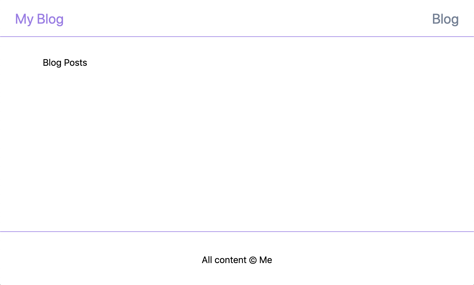
Refresh your browser and you should see something like this:

Now for some styling. We’ll set up Tailwind and start applying it to our layout. Install Tailwind:
npm install tailwindcss
Create a PostCSS config file (postcss.config.js) at the root of the project to load Tailwind as a plugin:
// ./postcss.config.js
module.exports = {
  plugins: ["tailwindcss"],
};
Create a tailwind stylesheet (styles/tailwind.css) to load up our tailwind classes:
/* ./styles/tailwind.css */
[@tailwind](http://twitter.com/tailwind) base;

@tailwind components;

@tailwind utilities;
Then import this stylesheet into our pages/_app.js file to load it into the application:
// ./pages/_app.js
import "../styles/tailwind.css";
...
Now restart your app and we should be ready to start applying Tailwind classes to style up our layout. We’ll give our layout a header, footer and content area. Update components/Layout.js like so (feel free to choose different colours, spacings, etc):
// ./components/Layout.js
import Head from "next/head";

function Layout({ children, pageTitle }) {
  return (
    <>
      <Head>
        <meta name="viewport" content="width=device-width, initial-scale=1" />
        <title>{pageTitle}</title>
      </Head>
      <div className="flex flex-col min-h-screen">
        <header className="w-full h-16 border-b border-purple-500 flex items-center justify-center">
          <div className="w-11/12 md:w-full max-w-3xl flex flex-row justify-between">
            <div className="text-2xl text-purple-500">My Blog</div>
            <nav className="text-2xl text-gray-600">Blog</nav>
          </div>
        </header>
        <main className="w-11/12 md:w-full max-w-2xl mx-auto my-8 flex-grow">
          {children}
        </main>
        <footer className="flex flex-col items-center w-full h-24 border-t border-purple-500">
          <div className="w-11/12 md:w-full max-w-3xl m-auto flex flex-row items-center justify-center">
            All content © Me
          </div>
        </footer>
      </div>
    </>
  );
}

export default Layout;
Alright, we’ve got a basic responsive layout with positions for a logo, navigation, content and a footer.
Markdown Part 1: Blog Post List and Dynamic Routes
We need a way to list our blog posts and link to pages to read them. We could manually create these links/pages every time we write a post but who wants to do that?! We know we’ll be writing our posts in Markdown so let’s create a couple of posts, load them up at build time, and generate the list and blog post pages for our static site.
Create a posts directory in the root of the project, and inside that directory create a couple of markdown files e.g.
## <!-- ./posts/first_post.md -->

---

title: "First Post!"
description: "New Year's resolution achieved, I started my very own blog!"
date: 1 January 2020

---

I wish I'd done this ages ago.

## <!-- ./posts/second_post.md -->

---

title: "Second Post"
description: "And I even followed through with a second post!"
date: 8 January 2020

---

Occaecat Lorem mollit cupidatat elit incididunt non consectetur eiusmod qui adipisicing duis sunt irure minim.

## Lorem Ipsum

Tempor sunt deserunt qui quis commodo voluptate laboris est ut qui in. Nostrud ut laborum ea mollit incididunt ea culpa nisi sint excepteur do. Eiusmod aliqua in adipisicing cupidatat excepteur.

## Hipster Ipsum

I'm baby enamel pin swag gastropub bitters migas lomo, dreamcatcher chartreuse vegan normcore. Trust fund chicharrones artisan live-edge portland swag jianbing knausgaard put a bird on it brunch pitchfork bushwick kinfolk. Unicorn bicycle rights waistcoat messenger bag hexagon glossier farm-to-table kinfolk poutine occupy vexillologist gochujang skateboard activated charcoal. Street art air plant tbh chicharrones, try-hard listicle bushwick chia glossier.

> Street art air plant tbh
javascript
const message = "Hello";
console.log(message);
We’ll need a webpack loader to handle these markdown files so install raw-loader:
npm install raw-loader
and update our next.config.js to add it to Next’s webpack config:
// ./next.config.js
const nextConfig = {
  target: "serverless",
  webpack: function (config) {
    config.module.rules.push({
      test: /\.md$/,
      use: "raw-loader",
    });
    return config;
  },
};

module.exports = nextConfig;
You will have noticed that I’ve added a few key:value pairs at the start of the markdown files — this is frontmatter, a block of YAML content that we’ll use as meta-data for our file. We’re not using a backend service for our posts (e.g. CMS, database) so we’re essentially using our markdown files as our data layer. Frontmatter makes this possible and we’ll use it for listing our blog posts. To read the frontmatter we’ll use the gray-matter package:
npm install gray-matter
Now we need a way to load these files when we’re building the app. Let’s create a JS file in the posts directory to house utility functions for working with our blog post files and add a function to gather up the data for our post list:
// ./posts/index.js
import matter from "gray-matter";

export const posts = () =>
  ((context) => {
    const keys = context.keys();
    const documents = keys.map(context);

return keys
      .map((key, index) => {
        // We'll use the filename as a 'slug' for the post - this will be used for the post's route
        const slug = key.replace(/^.*[\\\/]/, "").slice(0, -3);
        const document = documents[index];
        const { data: frontmatter, content: body } = matter(document.default);

        return { frontmatter, body, slug };
      })
      .sort(
        (post1, post2) =>
          new Date(post2.frontmatter.date) - new Date(post1.frontmatter.date)
      );
  })(
    // Since Next.js uses webpack we can take advantage of webpack's `require.context` to load our markdown files
    require.context("./", true, /\.md$/)
  );
And finally we can make use of this function to list the blog posts on our home page. If we export a function named getStaticProps from a page file, Next will run this function at build time and pass the result into our component as props. All we need it to do is return the result of our posts function and our component will receive the posts data! Update the home page as follows (adding the getStaticProps function and PostsList component):
// ./pages/index.js
import { posts } from "../posts";

import Layout from "../components/Layout";
import Link from "next/link";

const Index = ({ posts }) => {
  return (
    <Layout pageTitle="My Blog">
      <h1 className="text-2xl font-semibold">Blog Posts</h1>
      <PostsList posts={posts} />
    </Layout>
  );
};

const PostsList = ({ posts }) => {
  if (!posts || !posts.length) return <p>No posts found</p>;

  return (
    <div className="w-full">
      <ul className="mt-4">
        {posts.map((post) => {
          const { frontmatter, slug } = post;
          const { description, date, title } = frontmatter;

          return (
            <li
              key={slug}
              className="px-8 py-2 m-0 mt-4 border-b border-card-border hover:bg-gray-100"
            >
              <Link href={`/blog/${slug}`}>
                <a>
                  <div className="text-xl font-medium">{title}</div>
                  <p className="mt-2 mb-4 font-light">{description}</p>
                  <p className="text-sm font-hairline">{date}</p>
                </a>
              </Link>
            </li>
          );
        })}
      </ul>
    </div>
  );
};

export async function getStaticProps() {
  const postsData = posts();

  return {
    props: {
      posts: postsData,
    },
  };
}

export default Index;
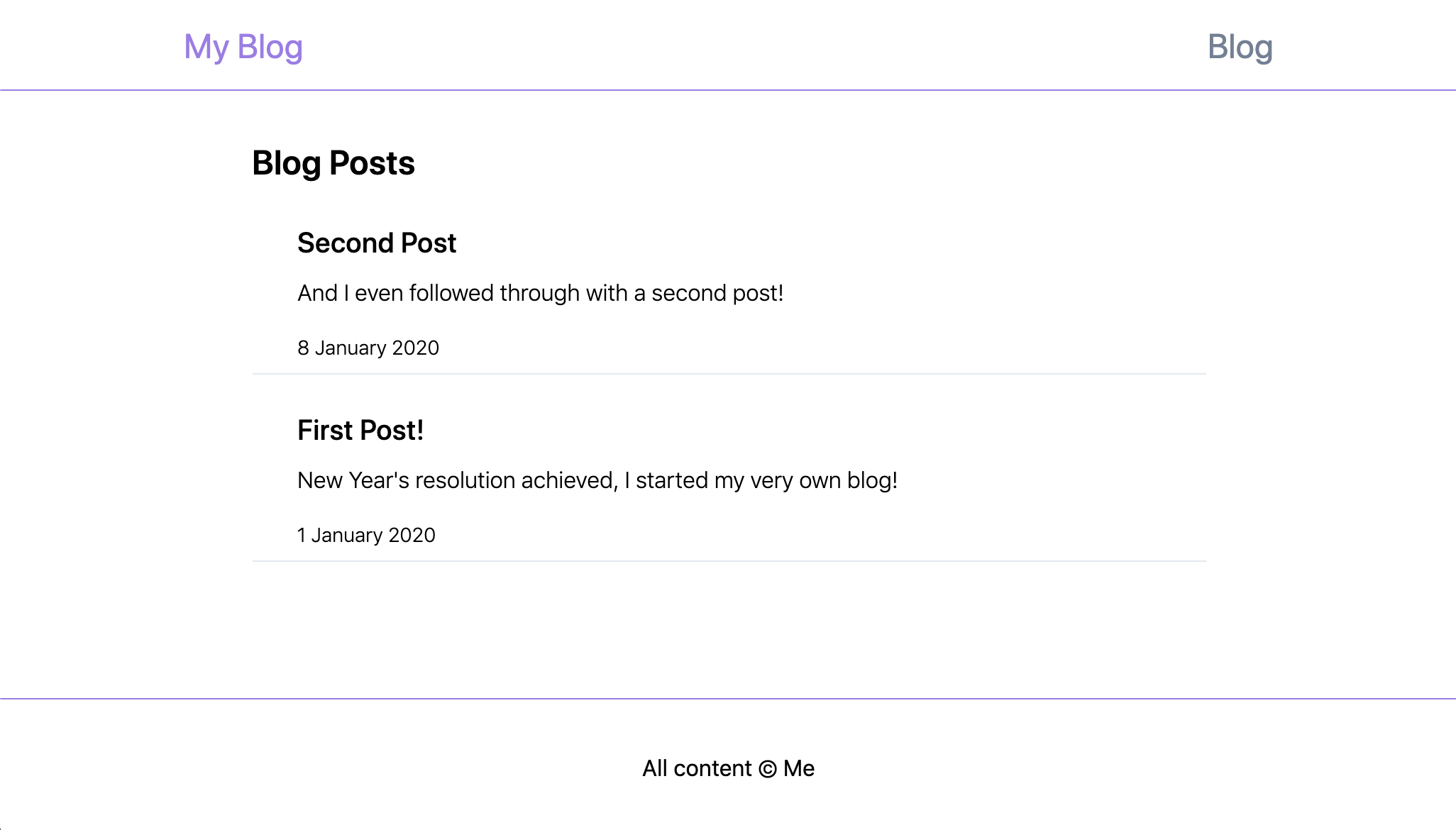
and you should now see your list of blog posts:
You’ve probably noticed that if you click on one of these posts you’re presented with a 404 page. We haven’t created our blog post page yet… onwards!
Markdown Part 2: Render Blog Post Content
Now we need to set up a page to render individual blog posts. Next.js uses the directory/file structure to define the available routes, and will dynamically generate routes when the filename is wrapped in brackets. Create a blog directory containing a [post].js file. This file will need to export three things:
-
a getStaticPaths function to define the routes that we want generated
-
a getStaticProps function to load the blog post for the page (much the same as we loaded all posts for the index page)
-
a React component for rendering the post
Let’s start with the routes. We’ll use the post slugs to define the routes so we’ll add a function to the posts/index.js utility file to generate the slugs from the file names (this is just a stripped down version of the existing utility function — feel free to use that function instead if you prefer):
// ./posts/index.js
export const postSlugs = () =>
  ((context) => {
    return context
      .keys()
      .map((key) => key.replace(/^.*[\\\/]/, "").slice(0, -3));
  })(require.context("./", true, /\.md$/));
Now we’ll need a function to get a post using its slug. Add this to the post utilities:
// ./posts/index.js
export const postForSlug = async (slug) => {
  const document = await import(`./${slug}.md`);
  const { data: frontmatter, content: body } = matter(document.default);

  return { frontmatter, body, slug };
};
Finally we can render the page using our new data wrangling functions. Populate the [post].js file like so:
// ./pages/blog/[post].js
import { postSlugs, postForSlug } from "../../posts";
import Layout from "../../components/Layout";

function Post({ frontmatter, body }) {
  if (!frontmatter) return <></>;

  return (
    <Layout pageTitle={frontmatter.title}>
      <div className="w-full">
        <article className="max-w-none">
          <h1>{frontmatter.title}</h1>
          <p className="italic">{frontmatter.date}</p>
          {body}
        </article>
      </div>
    </Layout>
  );
}

export async function getStaticProps({ params }) {
  const { frontmatter, body } = await postForSlug(params.post);

  return {
    props: {
      frontmatter,
      body,
    },
  };
}

export async function getStaticPaths() {
  const paths = postSlugs().map((slug) => `/blog/${slug}`);

  return {
    paths,
    fallback: false,
  };
}

export default Post;
Now if you refresh the home page of your app and click on the most recent post you should be directed to your newly created page that looks something like this:
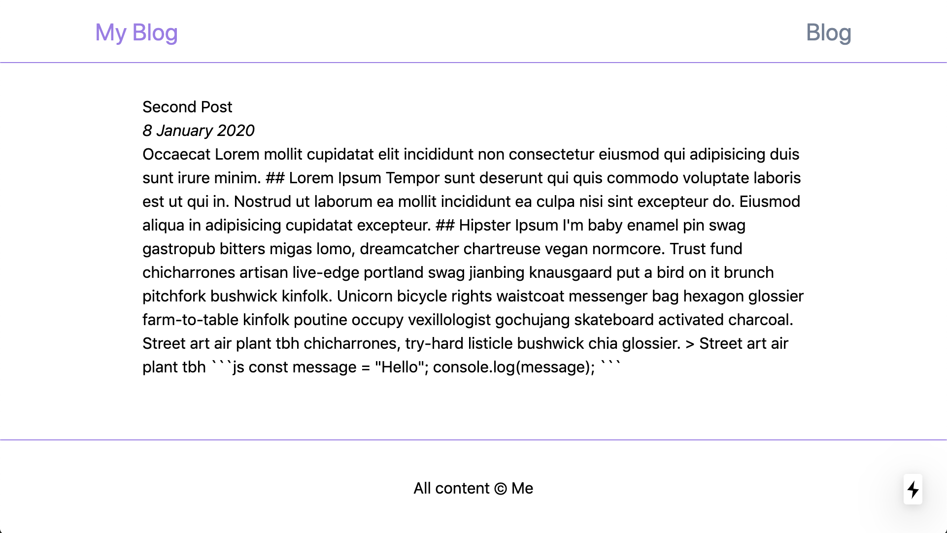
This is great but we still have some work to do. We obviously need some styling, but more importantly our markdown content is rendering as an unformatted blob of text — we want to get some semantic HTML onto the page. We’ll use react-markdown to sort that out:
npm install react-markdown
and update our Post component like so:
`// ./pages/blog/[post].js
import ReactMarkdown from "react-markdown";

`// ./pages/blog/[post].js
import ReactMarkdown from "react-markdown";

...

function Post({ frontmatter, body }) {
  if (!frontmatter) return <></>;

  return (
    <Layout pageTitle={frontmatter.title}>
      <div className="w-full">
        <article className="max-w-none">
          <h1>{frontmatter.title}</h1>
          <p className="italic">{frontmatter.date}</p>
          <ReactMarkdown source={body} />
        </article>
      </div>
    </Layout>
  );
}

...
Ok, so now our markdown content is translated to markup on the page, but it’s not looking very good.
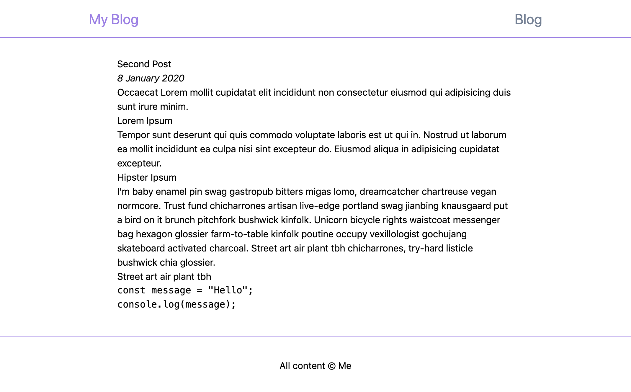
Tailwind (by default) has a very stripped back set of base styles, leaving us with a very plain looking page. This is done with good reason but, fortunately for us, a plugin has been created to add some sensible default styles back to the minimal base styles: Tailwind’s Typography plugin. Let’s add that in to give our styling a low-cost boost:
npm install [@tailwindcss/typography](http://twitter.com/tailwindcss/typography)
and now we’ll need to configure Tailwind to use this plugin. Create a tailwind.config.js file in the root of the project like so:
// ./tailwind.config.js
module.exports = {
  future: {
    removeDeprecatedGapUtilities: true,
    purgeLayersByDefault: true,
  },
  purge: ["./components/**/*.+(js|jsx)", "./pages/**/*.+(js|jsx)"],
  theme: {},
  plugins: [require("[@tailwindcss/typography](http://twitter.com/tailwindcss/typography)")],
};
This adds the Typography plugin and, while we’re at it, we turn on a couple of flags for future compatibility and specify sources to use when determining which tailwind styles are in use and which can be purged.
To use the Typography styles, all we need to do is add the prose class to our generated HTML:
// ./pages/blog/[post].js
...

function Post({ frontmatter, body }) {
  if (!frontmatter) return <></>;

  return (
    <Layout pageTitle={frontmatter.title}>
      <div className="w-full">
        <article className="prose max-w-none">
          <h1>{frontmatter.title}</h1>
          <p className="italic">{frontmatter.date}</p>
          <ReactMarkdown source={body} />
        </article>
      </div>
    </Layout>
  );
}

...
Restart the app and voilà, we have styled markup!
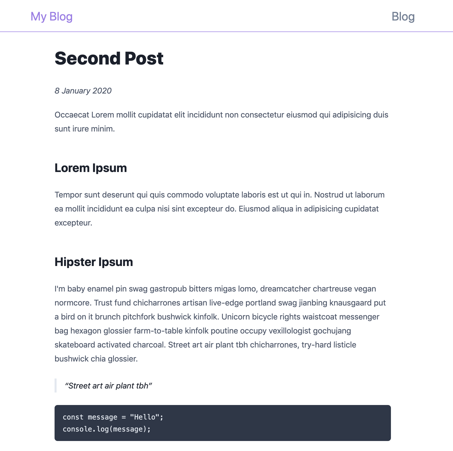
Sooo good, thanks Tailwind! But there’s still one more thing:
Code syntax highlighting.
Fortunately ReactMarkdown lets us define our own renderers for specific element types. We’re going to use highlight.js to create a custom code block renderer with built in syntax highlighting. Install the package:
npm install highlight.js
and create a CodeBlock component in the components directory:
// ./components/CodeBlock.js
import highlight from "highlight.js";

function CodeBlock({ value }) {
  const highlighted = highlight.highlightAuto(value).value;

  return (
    <pre className="hljs">
      <code dangerouslySetInnerHTML={{__html: highlighted}} />
    </pre>
  );
}

export default CodeBlock;
This will take our value (in this case the code block contents) and apply various hljs classes to the elements within. Don’t be concerned about the dangerouslySetInnerHTML prop — this code is only run at build time and allows the highlighting to be generated by the build system rather than the browser. Now we can use this component as our code block renderer — pass it in to the ReactMarkdown component like so:
// ./pages/blog/[post].js
import CodeBlock from "../../components/CodeBlock";

...

<ReactMarkdown
  source={markdownBody}
  renderers={{code: CodeBlock}}
/>

...
If you reload the app you won’t see any changes yet, but if you inspect the code block you’ll see hljs-xxx classes have been added to the HTML elements within the tags. So that’s all we’re missing, we need to load those classes. highlight.js ships with a generous collection of themes to choose from, you can preview them here. Once you’ve found a theme you like we can simply import it as global styles from our _app.js file. For example, add this line to use the Night Owl theme:
// ./pages/_app.js
import "../node_modules/highlight.js/styles/night-owl.css";

...
and we now have syntax highlighting in our code block!
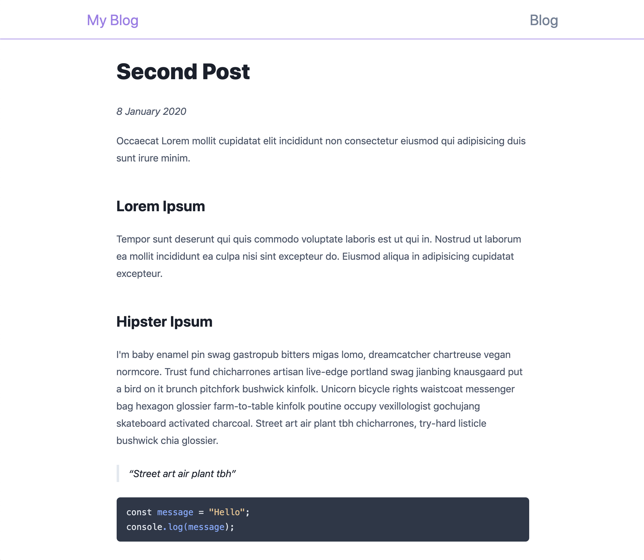
You can use ReactMarkdown’s renderers prop to further customise your markdown rendering as you like — for example, I preferred less whitespace around the headings so I created a custom heading renderer.
Finishing Touches
We’re in the home stretch! Now that we’ve got the basic blogging engine setup let’s add a few finishing touches before we deploy.
Favicon
As you can see our app is still using the default Vercel logo, we should replace it with something of our own. If you already have a logo then that might be an obvious choice but if you don’t, like me, you can generate a simple one from text for now using favicon.io’s generator. Just enter some text, choose your colours, download the result and unzip it into your ./public directory (overwriting the existing favicon.ico in the process).
Navigation
You’ll recall that our Layout component has a nav element but it doesn’t contain any links. It’d also be nice if our logo was a link to the root of the app. Next.js provides a Link component that we’ll use to wire this up. Wrap our logo with a link:
// ./components/Layout.js
import Link from "next/Link"

...

<div className="text-2xl text-purple-500">
  <Link href="/">
    <a>My Blog</a>
  </Link>
</div>

...
and you should now be able to click the logo to return to the home page. Create an AppNav component to replace the nav element:
// ./components/Layout.js
...

function AppNav() {
  return (
    <nav className="text-2xl text-gray-600">
      <Link href="/">
        <a className="hover:text-purple-500">Blog</a>
      </Link>
    </nav>
  );
}
and you should now be able to click the Blog nav link to return to the home page. But wouldn’t it be nice if the current nav link was highlighted? That’s easily fixed too, we just need to create our own wrapper for the Link component to update its styling when it’s active. Create an ActiveLink component:
// ./components/ActiveLink.js
import React from "react";
import Link from "next/link";
import { useRouter } from "next/router";

function ActiveLink({ href, activeClassName, children }) {
  const router = useRouter();

  const child = React.Children.only(children);

  let className = child.props.className || "";
  if (router.pathname === href && activeClassName) {
    className = `${className} ${activeClassName}`.trim();
  }

  return <Link href={href}>{React.cloneElement(child, { className })}</Link>;
}

export default ActiveLink;
This component renders a Link, and watches the current route to see if it matches the link’s href prop — if so it applies the specified activeClassName to the Link’s child component. Now swap out this component for the Link component in our AppNav component, passing in an activeClassName to highlight the active link:
// ./components/Layout.js
...

function AppNav() {
  return (
    <nav className="text-2xl text-gray-600">
      <ActiveLink href="/" activeClassName="text-purple-500">
        <a className="hover:text-purple-500">Blog</a>
      </ActiveLink>
    </nav>
  );
}

...
That’s it, we now have app navigation!
About Page
Your readers might want to know a little about the person behind the blog posts so let’s make a space for that. Thanks to Next.js and our new AppNav component, adding an About page is trivial. Create a new page:
// ./pages/about.js
import Layout from "../components/Layout";

function About() {
  return (
    <Layout pageTitle="About | My Blog">
      <article className="prose max-w-none">
        <h1>About</h1>
        <p>Hello, I'm a blogger and I blog about interesting things.</p>
      </article>
    </Layout>
  );
}

export default About;
and add an entry to our AppNav component:
// ./components/Layout.js
...

function AppNav() {
  return (
    <nav className="text-2xl text-gray-600">
      <ActiveLink href="/" activeClassName="text-purple-500">
        <a className="hover:text-purple-500">Blog</a>
      </ActiveLink>
      <ActiveLink href="/about" activeClassName="text-purple-500">
        <a className="hover:text-purple-500">About</a>
      </ActiveLink>
    </nav>
  );
}

...
And there we have it, an About page!
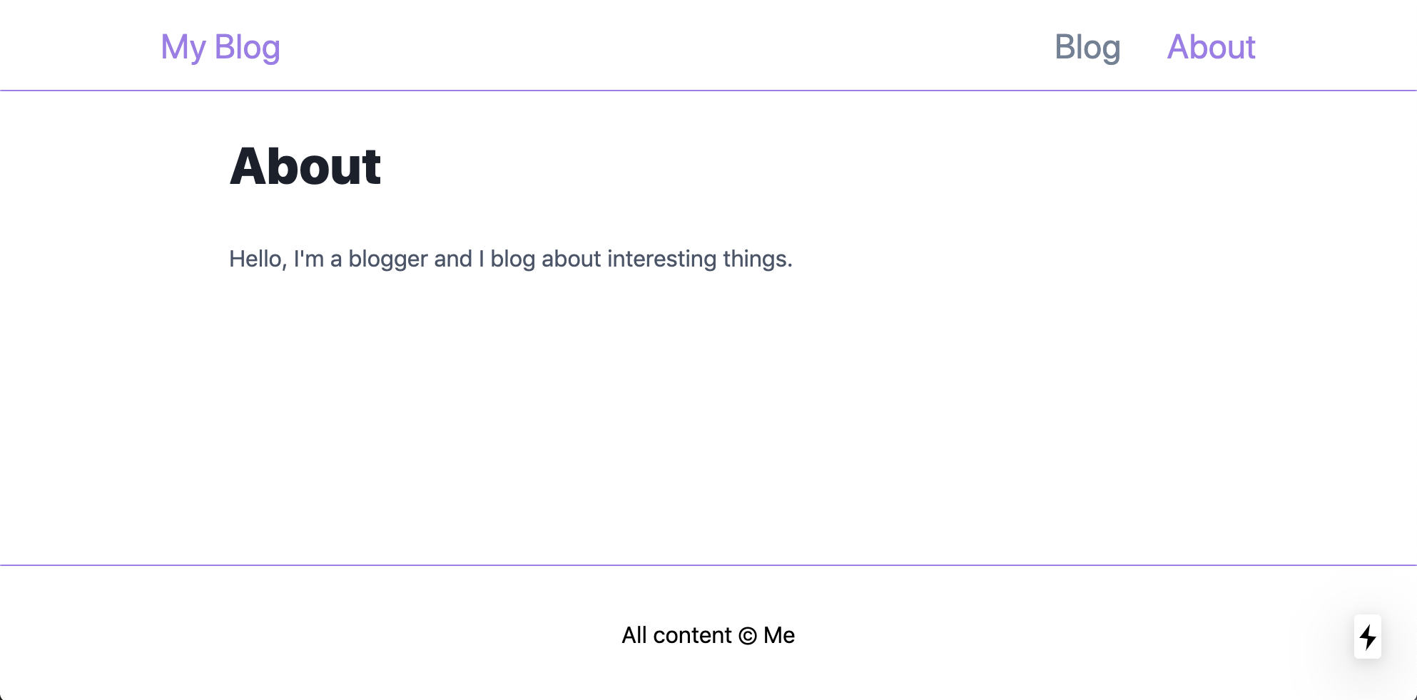
You might’ve noticed that we used Typography’s prose class for the About page, just like we did for our post page. While we’re at it we might as well use it for our home page to keep our styling consistent app-wide:
// ./pages/index.js
...

const Index = ({ posts }) => {
  return (
    <Layout pageTitle="My Blog">
      <div className="prose max-w-none">
        <h1>Blog Posts</h1>
      </div>
      <PostsList posts={posts} />
    </Layout>
  );
};

...
Footer
Our app’s footer is looking a little lacklustre, let’s use it to link out to our social media channels. We’ll use icons from Iconify for our links so we’ll need to install a couple of packages. The first is Iconify’s React library:
npm install [@iconify/react](http://twitter.com/iconify/react)
and the second is the package for your icon set of choice. I chose Simple Icons:
npm install [@iconify/icons-simple-icons](http://twitter.com/iconify/icons-simple-icons)
Now you can import the Icon component and all relevant icons and add them into our layout’s footer:
// ./components/Layout.js
import { Icon } from "[@iconify/react](http://twitter.com/iconify/react)";
import githubIcon from "[@iconify/icons-simple-icons](http://twitter.com/iconify/icons-simple-icons)/github";
import linkedinIcon from "[@iconify/icons-simple-icons](http://twitter.com/iconify/icons-simple-icons)/linkedin";
import twitterIcon from "[@iconify/icons-simple-icons](http://twitter.com/iconify/icons-simple-icons)/twitter";

...

function Layout({ children, pageTitle }) {
  return (
    <>
      <Head>
        <meta name="viewport" content="width=device-width, initial-scale=1" />
        <title>{pageTitle}</title>
      </Head>
      <div className="flex flex-col min-h-screen">
        <header className="w-full h-16 border-b border-purple-500 flex items-center justify-center">
          <div className="w-11/12 md:w-full max-w-3xl flex flex-row justify-between">
            <div className="text-2xl text-purple-500">
              <ActiveLink href="/">
                <a>My Blog</a>
              </ActiveLink>
            </div>
            <AppNav />
          </div>
        </header>
        <main className="w-11/12 md:w-full max-w-2xl mx-auto my-8 flex-grow">
          {children}
        </main>
        <footer className="flex flex-col items-center justify-center w-full h-24 text-gray-600 border-t border-purple-500">
          <nav className="flex flex-row">
            <a className="mr-6" href="https://github.com/">
              <Icon className="w-6 h-6" icon={githubIcon} />
            </a>
            <a className="mr-6" href="https://www.linkedin.com/">
              <Icon className="w-6 h-6" icon={linkedinIcon} />
            </a>
            <a href="https://www.twitter.com/">
              <Icon className="w-6 h-6" icon={twitterIcon} />
            </a>
          </nav>
          <div className="mt-2">
            All content © Me
          </div>
        </footer>
      </div>
    </>
  );
}

...
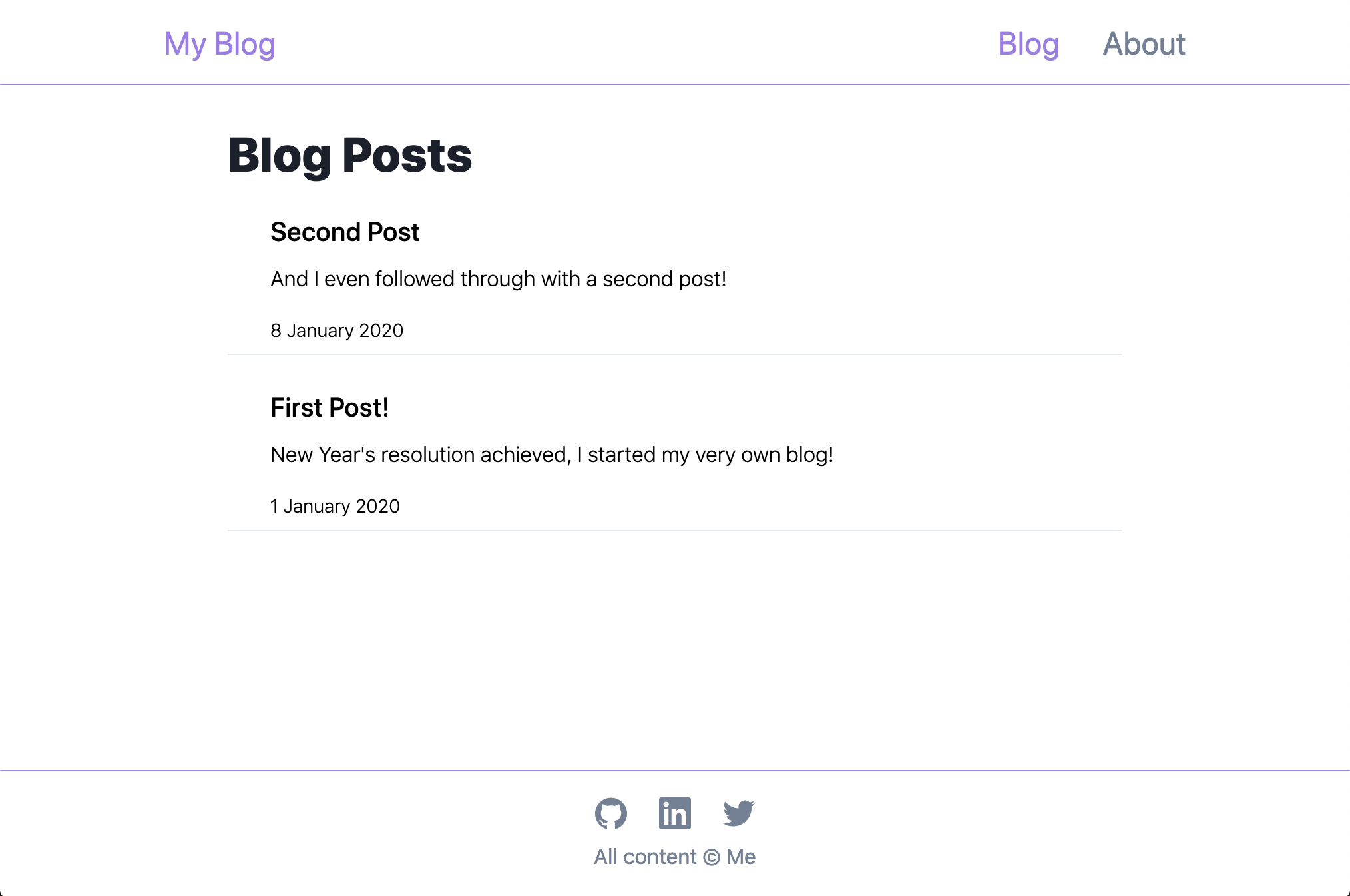
Huzzah! Your blog starter is complete!! 🎉 🎉 🎉
Ship It
As I mentioned earlier, deployment with Netlify is really simple. You can just push your code to a git hosting provider (e.g. GitHub), point Netlify at your repo to create a new site, and tell Netlify how to build your application. Eli Williamson and Jason Lengstorf have written a great guide on Netlify that will step you through the process in more detail but here are the basic steps:
-
If you haven’t already, push your code to GitHub, GitLab or Bitbucket
-
Create a Netlify configuration file in your project to tell Netlify how to build your app:
# ./netlify.toml
[build]
  command = "yarn build && yarn export"
  publish = "out"
- Create the export script in your package.json for Netlify to run
// ./package.json
...
"scripts": {
  "export": "next export"
}
...
-
On Netlify, create a New site from Git (you’ll need to link to your git hosting service and authorise Netlify to access it, then select your personal-blog repo)
-
Netlify should see your netlify.toml file and prefill the build settings
-
Click Deploy site
-
Celebrate 🎊
Netlify has now generated a new subdomain on their netlify.app domain to host your app! You can simply rename this subdomain if you’d like. I won’t cover it here but I would recommend purchasing your own domain name and configuring it for Netlify to use with your new site, even easier: you can register your domain name with Netlify directly.
Next Steps
Now that we’ve shipped our blog platform the most important thing to do is start writing. Establish a habit of writing and publishing regularly. You don’t need to write novellas, your posts don’t need to be perfect, just write about what interests you and form the habit. I’d encourage you to take a similar approach to writing as we did with shipping this blog app: start simple and iterate. Aim for incremental improvements rather than waiting to be great at something before you do it.
This would also be a good time to start thinking about what other features you might want in your platform and make a plan to add them (you could write about these too if you’re stuck for ideas). For example, here’re a few tasks/features I’ve lined up for mine:
-
Optimise for web search (SEO)
-
Custom error pages
-
Enhanced navigation (e.g. next/prev post)
-
Optimised image handling
-
Tagging and filtering
-
Search
-
Cross posting to other platforms
-
Styling refinements
-
Reader interaction (probably not comments, possibly social media… twitter?)
Conclusion
If you’ve been following along I hope that you’ve found this guide useful and that it’s helped you set up your own blog. If following guides isn’t your thing and you just want a head start on creating a blog like this one feel free to fork the repo on Github and make it your own.